
review by Kristen Maiorana
On September 25th, my boyfriend Omar and I attended the Alberta Cultural Days at the Art Gallery of Alberta. Walking through the doors of the architectural phenom that is the gallery, we were expecting a celebration of our province’s culture, with many booths focusing on its rich diversity and history.
Instead, we were left sorely disappointed by the few plastic tables covered in crafting supplies: glitter glue, scissors, construction paper, and so on.
The event was quite a letdown, with very few families in attendance, their children colouring or making little crafts that had little to no relation to Alberta’s culture and history. It was safe to say that neither Omar nor myself were interested in what the cultural days had to offer. We would not, however, allow our disappointment in these so-called “cultural days’ sully our experience of the gallery. We could still explore the other exhibits.
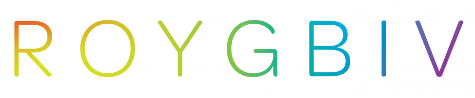
The woman at the front desk explained that there were three floors, each housing one or two exhibits. We started at the top floor and the entrance to the first exhibit welcomed us into a world of vibrant colour, an exhibit called ROYGBIV. Claiming to be a maximalist tribute to colour, it’s true to its name and does not disappoint, and runs until January 2, 2022.
Kapwani Kiwanga, Shoplifter (Hrafnhildur Arnardottir), Rodney LaTourelle, Louise Witthoft, and Anri Sala have created an interactive and immersive experience showcasing the way colours can impact human emotion. Each artist’s contribution revolves around the ways in which colour can control or engage you, and bring you joy, passion, or rage.
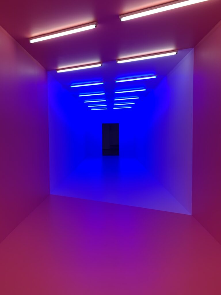
photo by Kristen Maiorana
My favorite piece in the ROYGBIV exhibit was an installation called pink-blue by artist Kapwani Kiwanga. It consisted of a long hallway, half painted in Baker-Miller Pink and half white. The pink half was illuminated by white fluorescent light, the white half-illuminated by blue.
An infographic on the wall beside the installation informed me of a study that showed short exposure to Baker-Miller Pink would reduce violent and hostile behaviour in prison inmates. However, prolonged exposure to rooms this shade of pink actually increased hostile behaviour in inmates, and some even began picking paint from the walls.
Despite the negative effects associated with extended exposure to the colour, many prisons, jails, health facilities, and other institutional settings are painted Baker-Miller pink. In contrast, blue light is often used in public washrooms to discourage intravenous drug use, as it makes veins difficult to see. In actuality, drug use still occurs and becomes increasingly dangerous when veins are not visible.
This exhibit demonstrates that colour seems to have become a tool of social and disciplinary control. Regardless of good intent, the outcome of employing these controls can be harmful.
Walking through the hallway, the light seems to dampen some of your senses, as all you can focus on is the intense, all-consuming colour presented to you. Walking from the pink to white end is very disorienting, in a way that feels as though you’re walking through an optical illusion. I quite enjoyed this feeling of disorientation and sensory deprivation, though it made Omar feel a bit uncomfortable and gave him a headache.
This installation is definitely not for those sensitive to bright light, and unfortunately there were no warning signs regarding this. In contrast to how colour is used as a social and disciplinary control in pink-blue, it is used to empower those previously controlled by the government, in another installation in ROYGBIV.
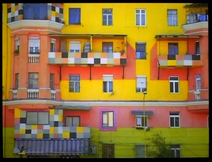
Dammi i Colori, Omar’s favourite installation, is a short film made in 2003, depicting the rubble-filled streets of Albania after a civil war broke out. Artist Anri Sala took to the streets of the previously communist country to document the aesthetic changes in the city once the government was overthrown and Sala’s friend and fellow artist Edi Rama had become mayor of Tirana, Albania’s capital city.
In an effort to rid the city of its unitary shades of grey and beige, indicative of a communist government, buildings were painted in a multitude of brilliant, provocative colours and abstract patterns. The bright colours now decorating the city’s capital seemed to bring joy and thus control back to the people.
Though the video was a bit repetitive, the vivid bursts of colour throughout the otherwise grey and beige city were hard to ignore; Omar thought the bright, new colours could represent the people. Neutral grey and beige tones seemed to mimic the apathy of a communist government, while the bright colours gave power and life back to those living in the city. The phrase Dammi i Colori means ‘give me the colours’, and seems fitting, as the colour introduced to the city came alongside the handing over of control to Albanian citizens. The government could no longer ignore the bright, resilient voices of the community.
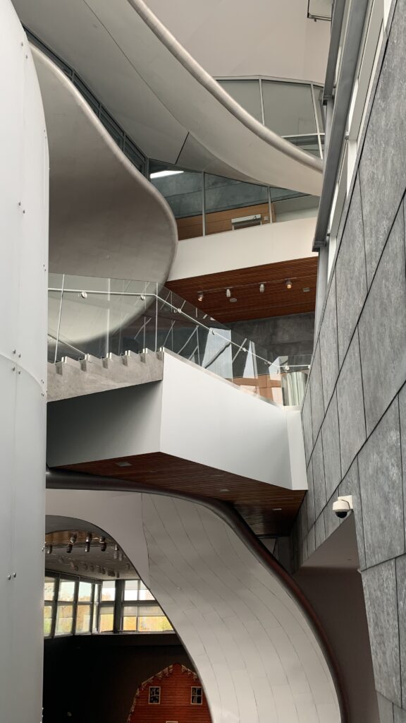
Other installations included First We Take the Museum by Rodney LaTourelle and Louise Witthoft, a mixed media piece meant to mimic the curved architecture of the AGA itself. Walking around the circular piece, I wasn’t particularly engaged or interested. In my opinion, it missed the mark a bit. It did not seem to mimic the AGA at all and merely seemed like a collection of mirrored, wooden or plastic slats painted with different colours and arranged in a circle. Perhaps the problem is that I prefer pieces with more of a story behind them rather than those that require a much more objective approach.
Omar, though he didn’t love the piece, was reminded of a cylindrical stop motion toy. The purple gradient going around the outside of the piece, stagnated by thin vertical mirrors, showed you an intermittent glimpse of your reflection. Perhaps the abstract nature of the piece was meant to reflect the uniqueness and objectivity of the viewer as well as the AGA.
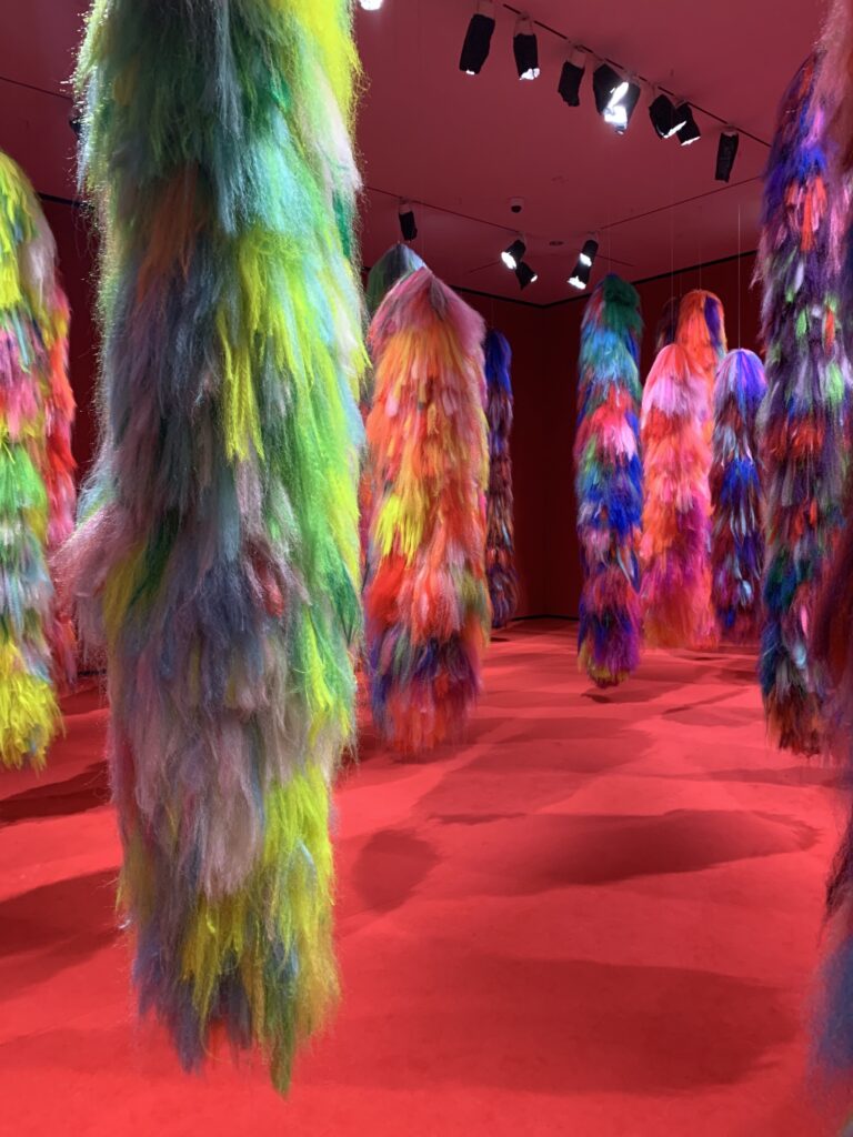
photo by Kristen Maiorana
Hyperlings by Shoplifter / Hrafnhildur Arnardottir is another installation that made me scratch my head a bit. Strings of synthetic and natural hair of all different colours were suspended from the ceiling, meant to facilitate an escape to whatever reality you choose.
Walking through the fuzzy forest, Omar felt as though he was in lollipop land or the inside of a unicorn. To me, the piece merely seemed like a collection of fuzzy, vibrant, upside-down trees. In addition, we were expecting the hairs to be soft to the touch, but were disappointed when they felt more like an itchy wool sweater than a soft fuzzy teddy bear.
Of course, the piece may not have been intended for touch, but a lack of instruction in itself was enough of a silent go-ahead for us to touch it anyways.
Finally, Patchwork by Kapwani Kiwanga is a series of wooden panels, each painted with two different colours. Painting the walls of institutions in two colours arose from the need to clean the bottom portion of the walls to prevent illness from being spread. The dual colour schemes used were observed by Kiwanga in several institutions.
While a fascinating concept and visual, this installation seemed a bit lackluster, especially compared to pink-blue and Dammi i Colori.
Despite our initial disappointment about the Alberta Cultural Days, our time at the Art Gallery of Alberta was definitely not wasted. The ROYGBIV exhibit opened my eyes to the many depths I didn’t realize colour could reach. I never thought that a certain shade of pink could have such a negative effect on someone’s mood, or that the stark contrast between bright colours and muted neutral tones could symbolize significant changes made within a government.
ROYGBIV has given both myself and Omar a new perspective on what colour can signify and how it may affect those observing it. Though I didn’t completely understand each installation, the exhibit as a whole was an eye-opening, enjoyable, and informative experience that I would recommend to anyone looking for something to brighten their day.
ROYGBIV runs at the Art Gallery of Alberta until January 2, 2022
website
