I recently decided to drag my partner, Cole, to the Art Gallery of Alberta. He’s actually colourblind (sorry, blue/purple deficient), so I thought it would be a fantastic idea to take him to an exhibition that explored what?
Colour.
After days of pestering him, we took the LRT over to the gallery and hiked up several flights of stairs to enter. We walked into the foyer, and the building opened up to a bright atrium with metallic and contemporary designs. It was actually free for me because I am Indigenous, but for Cole, he paid by donation (it’s pay what you can).
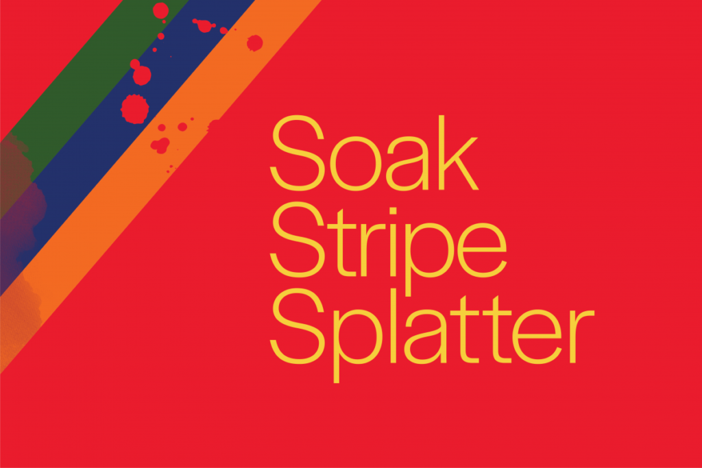
The Soak, Stripe, Splatter exhibition opened on October 9th, 2021 and goes until January 30th, 2022. The premise of the exhibition is simple. It explores and prioritizes the perception of colour. The Gallery hosts a variety of art pieces, and to my surprise, has a collection of art that is as old as the 1940s. It’s not like colour didn’t exist then, I just was expecting this to only have contemporary works.
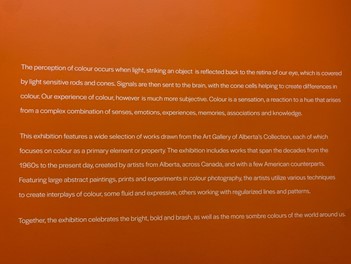
The entry of the exhibition had a large orange wall with a written introduction, which argued, “Colour is a sensation, a reaction to a hue that arises from our senses, emotions, experiences and knowledge”. Then we turned a corner to a vast and open space that housed a variety of canvasses. Some were as large as a small car, others were only a few inches wide and long. Still, I nearly pressed my nose to nearly all of them in awe of what these artists created.
Three pieces stood out to me.
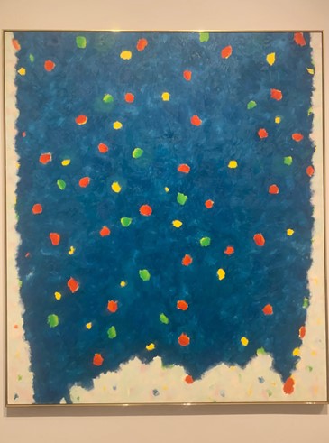
Cole and I stared at this big blue painting (I could not find a size, but it had to be about 36×45 inches) for a few minutes like that one scene in Ferris Bueller’s Day Off, and debated how the artist completed this piece. I think for him, it was just a blue painting. I also poked fun and asked if he thought it was blue or purple. He teased me for sounding pretentious. It was a cloudlike piece with spots of green, red, and yellow.
“I love it,” I initially said from afar.
“Why, because it’s blue?” Cole asked, knowing it’s one of my favourite colours.
I stared for 30 seconds and then said, “Nevermind I don’t like it that much, I thought it would look cooler up close.” To me, it looked almost flat. It didn’t feel like it had that much dimension or anything that evoked a ton of feeling. I guess you could argue that no feeling is a feeling in and of itself.
“Actually, this was painted by a survivor of the holocaust, he couldn’t paint during the war and hid his paintings, it looks like this was complete in 1973,” Cole noted while reading the description. It was also appropriately named Blues (oil on canvas). Gershon Iskowitz was actually sent to Auschwitz in 1942, and found cunning methods to continue doing art late into the night, and hid his work come morning.
My jaw hit the floor. I stood at the painting for a bit longer and felt Cole leave my side, I looked at the same piece from different vantage points. Suddenly the boring blue warmed, and the little dots of colour were flowers in an overcast sky. Oops, perhaps I was too harsh on this artist.
We turned about the room some more, but I kept gravitating towards the blue piece. What once was an overly simplistic piece, became a warm expression of an artist’s love for colour in a time when the world felt grey. It was the silent, gentle love of art in a time when freedom of expression was revoked. The twisting, cloudy brush strokes around the edges of the canvas became a threat to originality and life.
Across the room, a large orange painting sat alone on a wall.
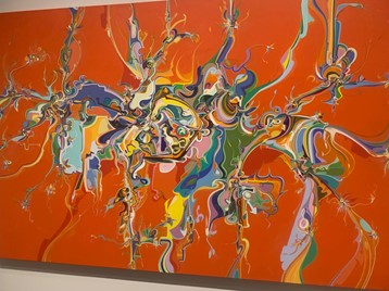
“The artist is Indigenous,” I said to Cole, motioning to the art.
“How do you know?” he asked.
“The line weight and the way that it looks is very reminiscent of some Indigenous art that I have seen before.”
Lo and behold, I was right. Alex Janvier’s painting had an entire wall for itself. This piece was huge, and had a vibrant orange background. Had this been painted on a wall, I would have called it a mural. Janvier was actually a survivor of the Blue Quill Indian Residential School, which felt interesting to have all of these survivors’ paintings in one place.
This one above all, resonated the most with me. I felt like I had known this art my entire life. Despite all these vibrant colours. This art hurt me, and for once, I lacked the words to explain how. To my surprise, Lubicon (1988), was actually acrylic on canvas (I thought it could have been oil and gouache). Despite how vibrant the hues were, and how matte the finish was. Although this was considered abstract, my brain wanted to call this a painting of a map. It looked like Janvier manipulated ink or oil on water, but it was only acrylic on canvas.
Upon further research, Lubicon is a Cree Nation that has endured several land disputes. My intuition about this being a painting of land was correct. This made the painting that much more important to me.
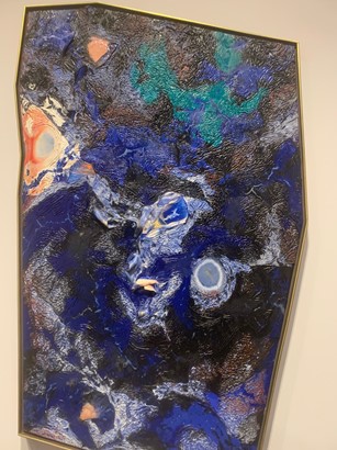
One of my favourite explorations of colour was an acrylic on canvas painting by Graham Peacock, which was completed in 1997. Funnily enough, it was titled Starry Night.
I adored the unconventional shape of the canvas (which no dimensions are listed). It felt organic to me, nothing about this piece felt synthetic.
This piece was reminiscent of the ocean from an aerial perspective. It felt like I was watching a storm build from a plane. I thought the texture was incredible.I wanted so desperately to run my fingers along the textured bits. It kind of reminded me of when soup with a meaty base dries up a little, and after some time a layer of film collects at the top.
Because of the moments that I felt in those three instances, I would recommend this exhibition to anyone. There was a horde of paintings that elicited the same emotions as the three examples I shared. I think this gallery was appropriate for pretty much any audience. The art might’ve been abstract, but it is tangible, even if you don’t usually enjoy art. The colours were all as vibrant as you would imagine. The gallery was right, colour is a reaction.
This exhibition boasted some of the most emotion-inducing colours I have seen in a long time. Some, like the Blues piece, though light in colour, felt anguished, while others felt jubilant. I must say, I made no mistakes in dragging my partner to this exhibition.
Soak, Stripe, Splatter
until January 30
Art Gallery of Alberta
2 Sir Winston Churchill Square
website